Who?
Health, Humour, Premium
A refresh of the branding and packaging for a Tasmanian company Tea Hee Hee. They offer high quality teas using the highest quality ingredients, only organic, wild picked & fair trade, prepared by a Naturopath/Herbalist.
Brand essence Health, Humour, Premium
HOW?
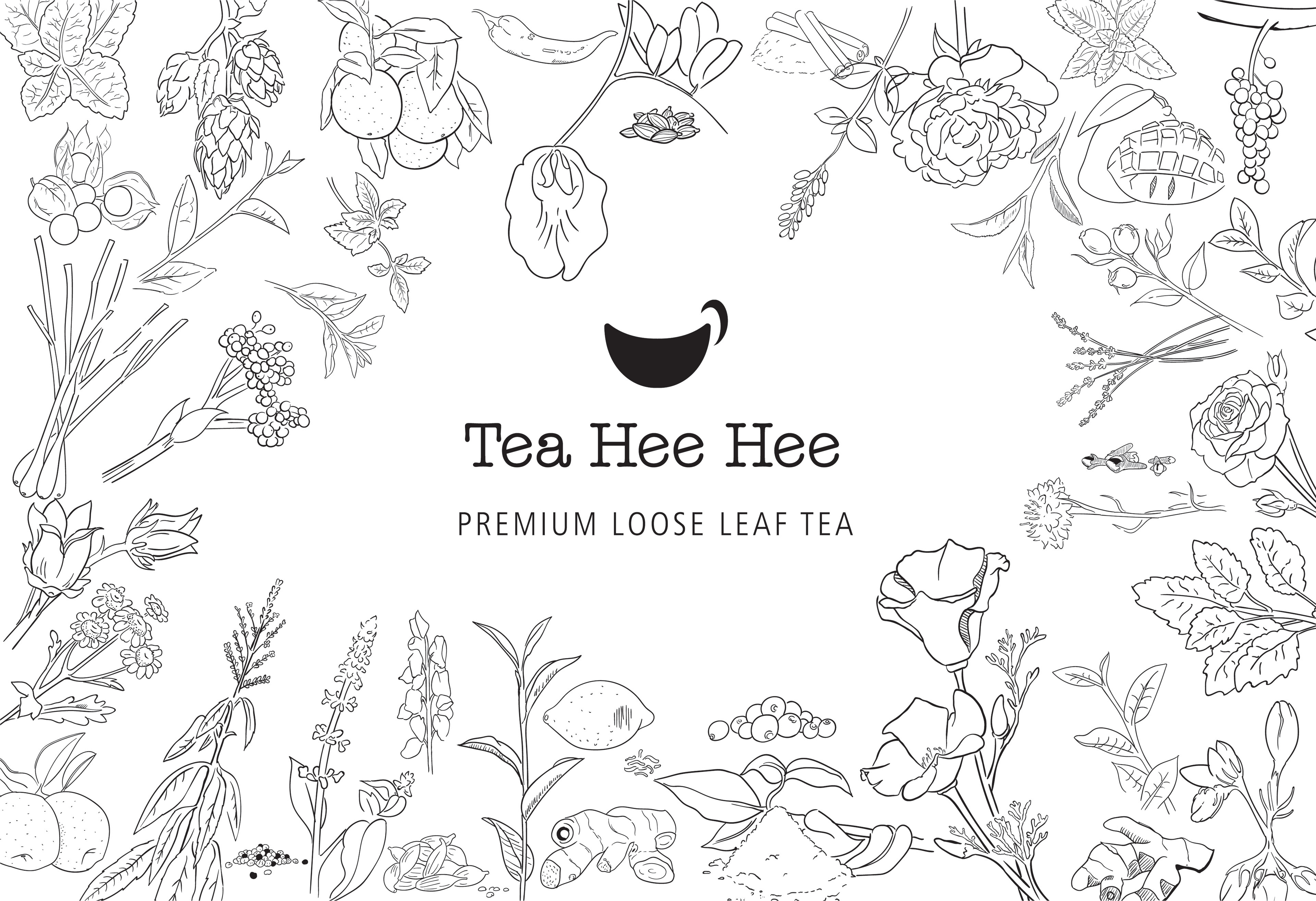
The logo mark is a smile and a cup conveying the core brand essence. The use of American typewriter alternative typeface pays tribute to the existing branding but is modernised. The typeface is quirky fun and humorous.
This was a vast but enjoyable undertaking.
This was a vast but enjoyable undertaking.
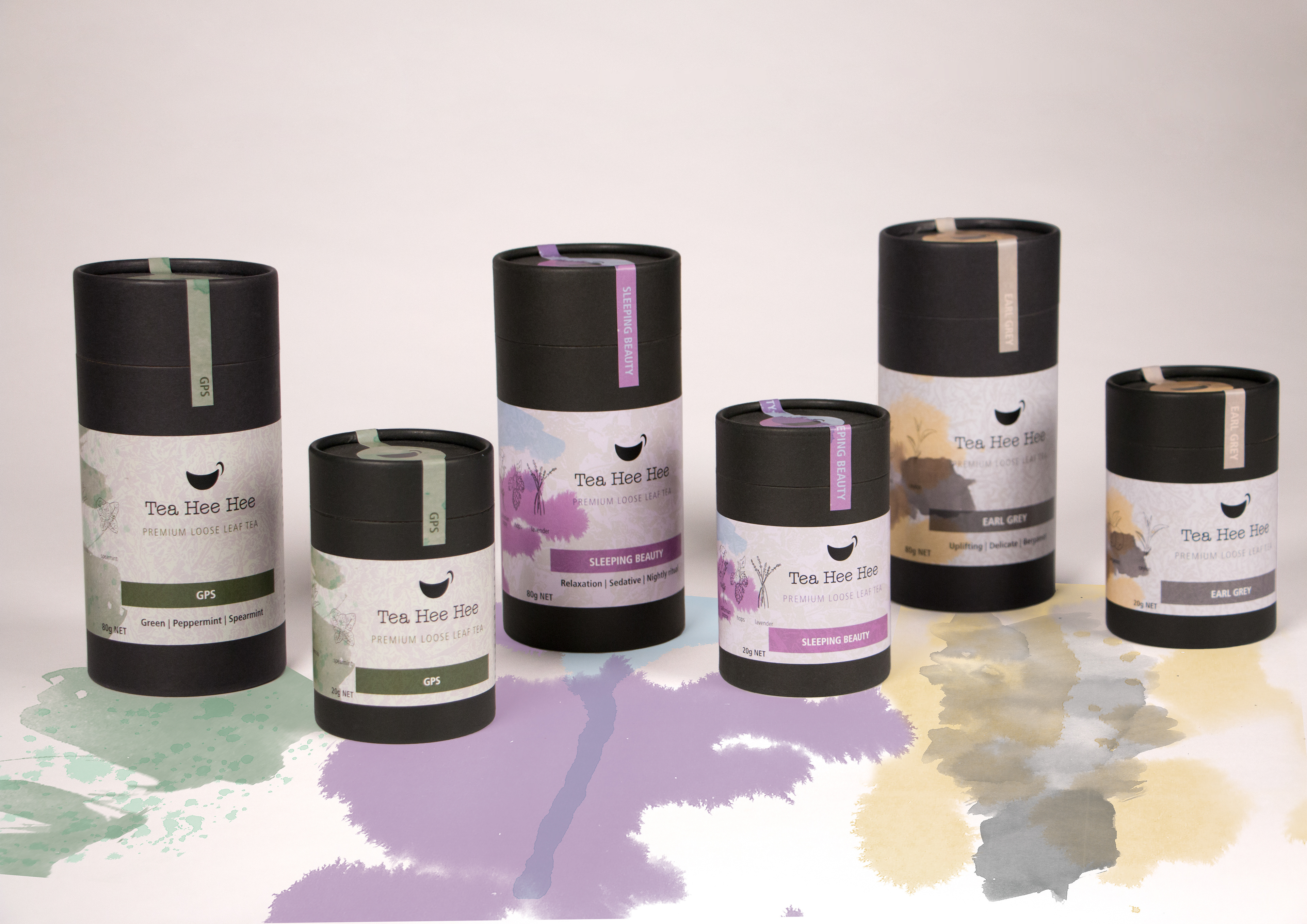
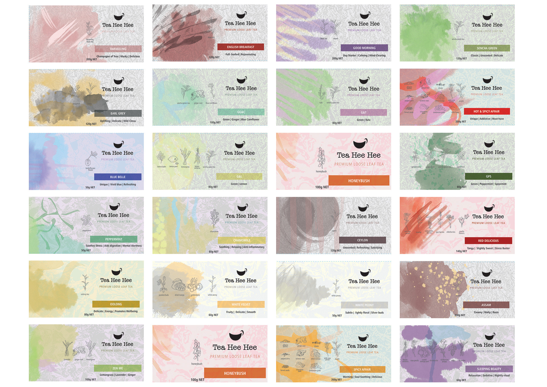
- Twenty five different variants.
- Various sized packaging for each (60+ labels)
- Service tubes, Bulk bags.
- A full collateral package.
- Individual ink artworks that represent the characteristics of the tea, from energetic to relaxing.
- A range patterns informed by the tea granules to differentiate between, herbal, green and black.
- Every botanical ingredient illustrated.