Who?
Branding & identity for a Melbourne based catering company.
Branding & identity for a Melbourne based catering company.
Brand essence
Street food, Personal, Melbourne Cool.
Street food, Personal, Melbourne Cool.
How
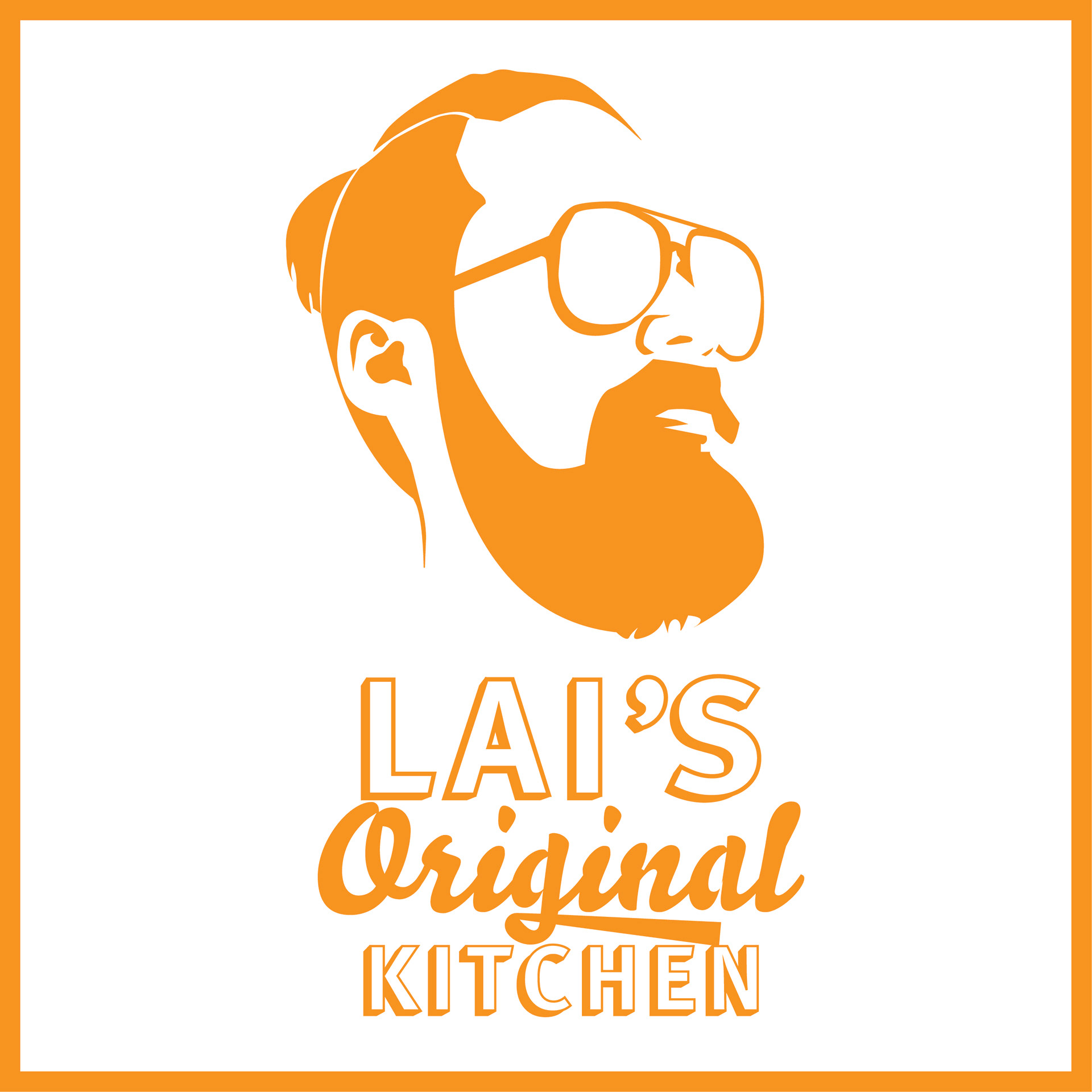
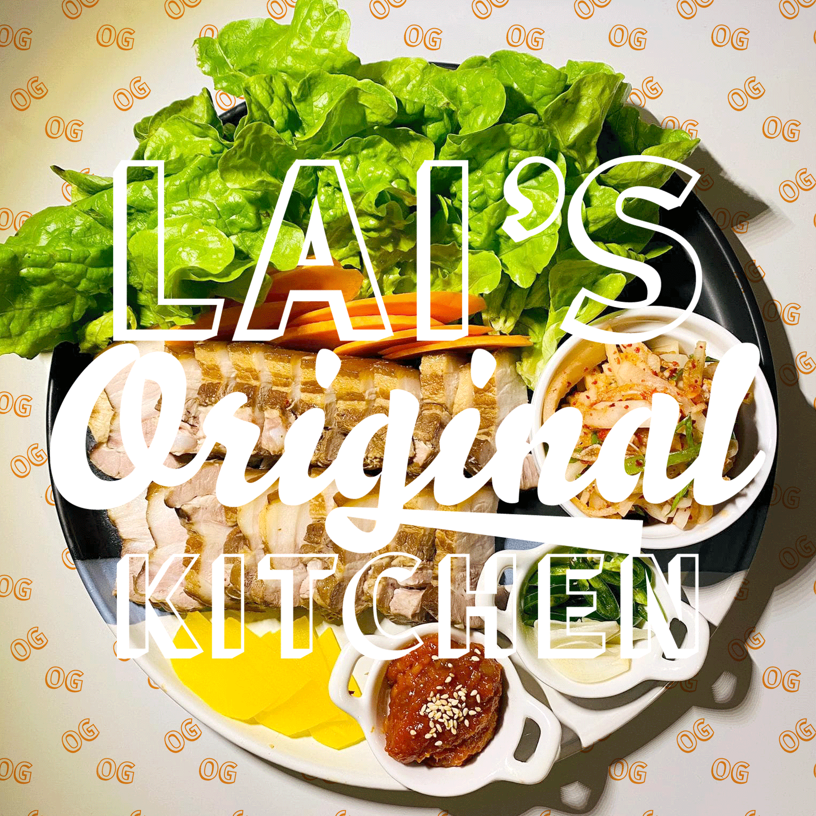
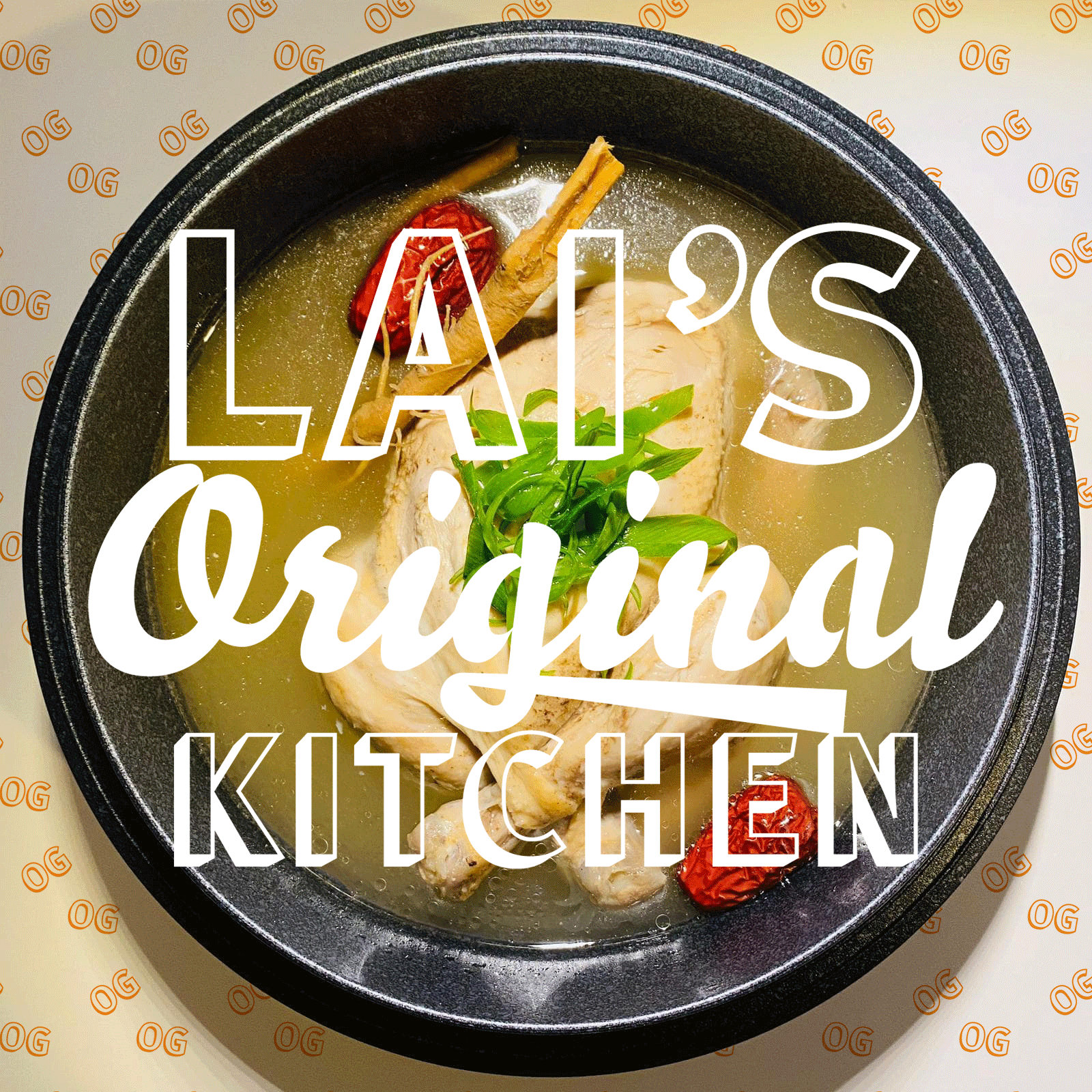
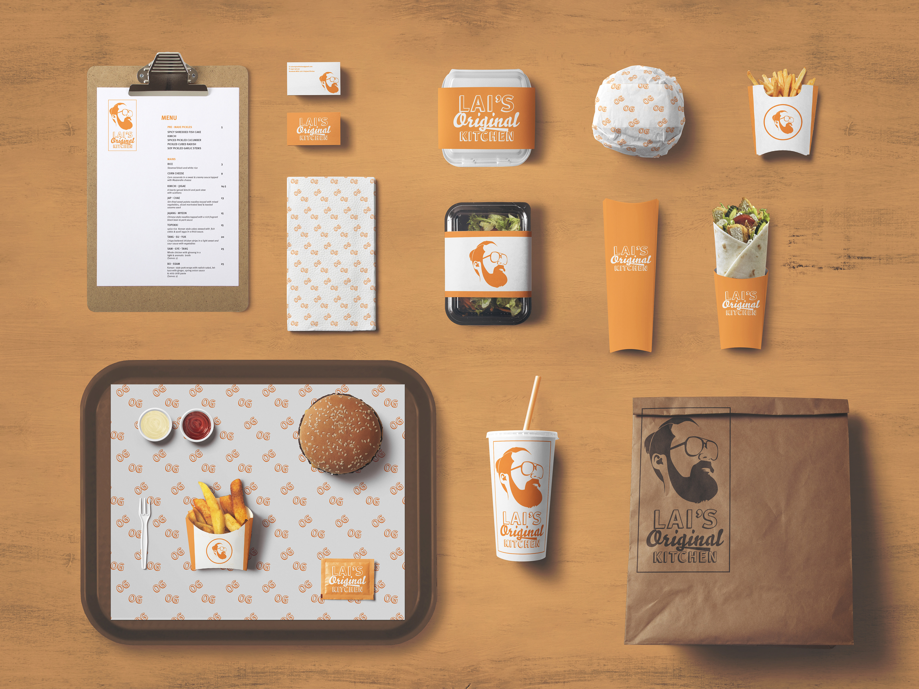
The striking impact of such a strong single company colour helps with recognition. Lai's Original Kitchen creates a fusion of asian cuisine, so the underlining theme was to represent street food. Lai, the owner and chef, wanted to subtly emphasise the "gina" of the "original" logotype, as a personal, hidden homage to his wife Gina. The boxed logotype represents street food with its roots and acts as the bun to the "original" meat. The quirky, simple caricature of Lai achieves the personal and "Melbourne cool" aspects of the essence whilst being highly memorable.
The striking impact of such a strong single company colour helps with recognition. Lai's Original Kitchen creates a fusion of asian cuisine, so the underlining theme was to represent street food. Lai, the owner and chef, wanted to subtly emphasise the "gina" of the "original" logotype, as a personal, hidden homage to his wife Gina. The boxed logotype represents street food with its roots and acts as the bun to the "original" meat. The quirky, simple caricature of Lai achieves the personal and "Melbourne cool" aspects of the essence whilst being highly memorable.