WHo?
A Bendigo based Occupational Therapist specialising in young men, aged 13-36.
Brand essence Contemporary - clean, negative space
Calming - caring, soft, approachable
Slightly masculine - bold
HOW?
Logotype
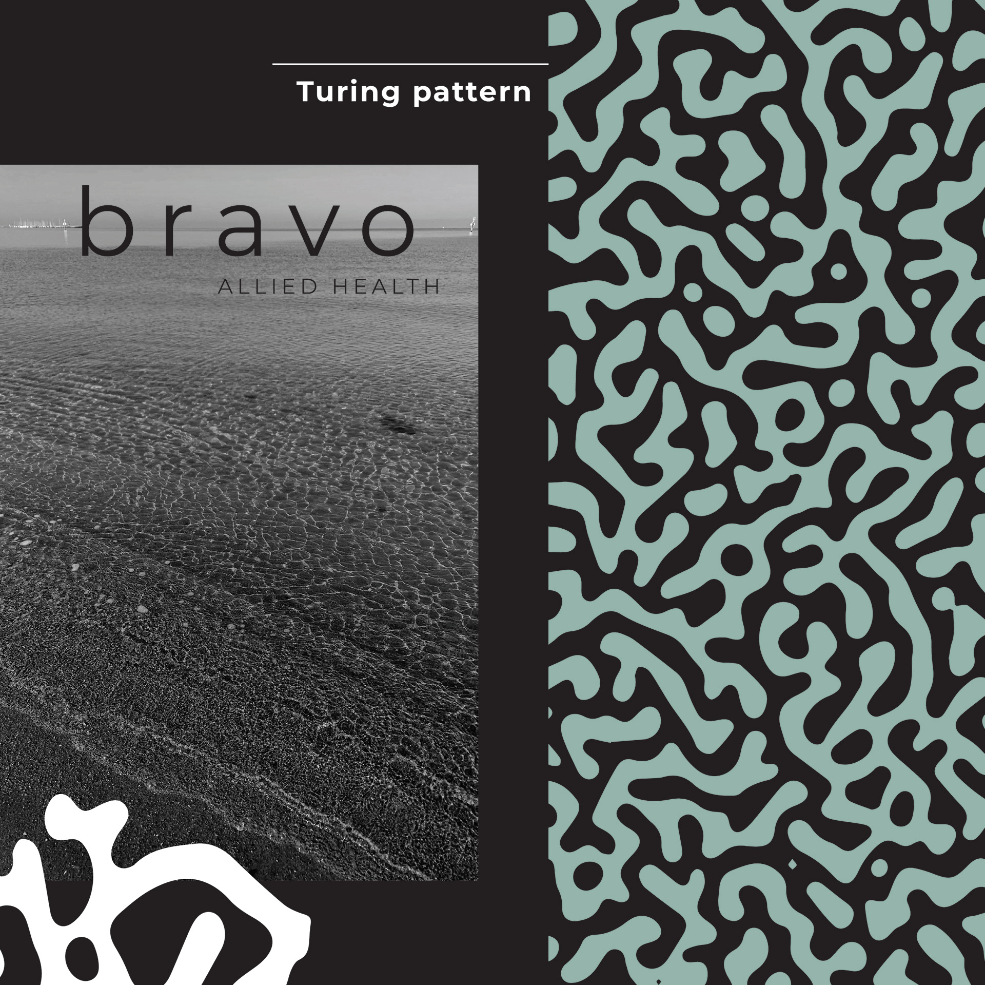
The company typeface is Montserrat. It feels contemporary with circular forms and negative space. The main design challenge with this branding was to strike the balance between calming/soft and masculine. I used the logotype at a medium weight which gives it strength but with a modern feel. The use of a bluish/green colour whispers that of a calm ocean and gives an element of slightly masculine yet approachable. The logotype in lowercase is more familiar and less threatening, it's kerned to accentuate the space, allowing the letters to breathe.
Brandmark
• Two hands clapping - it's positive and aligns with the phrase “bravo”.
• Represents a “b” for bravo.
• It also symbolises a “mould” shattering, breaking free, forming a path.
• Two hands clapping - it's positive and aligns with the phrase “bravo”.
• Represents a “b” for bravo.
• It also symbolises a “mould” shattering, breaking free, forming a path.
Pattern
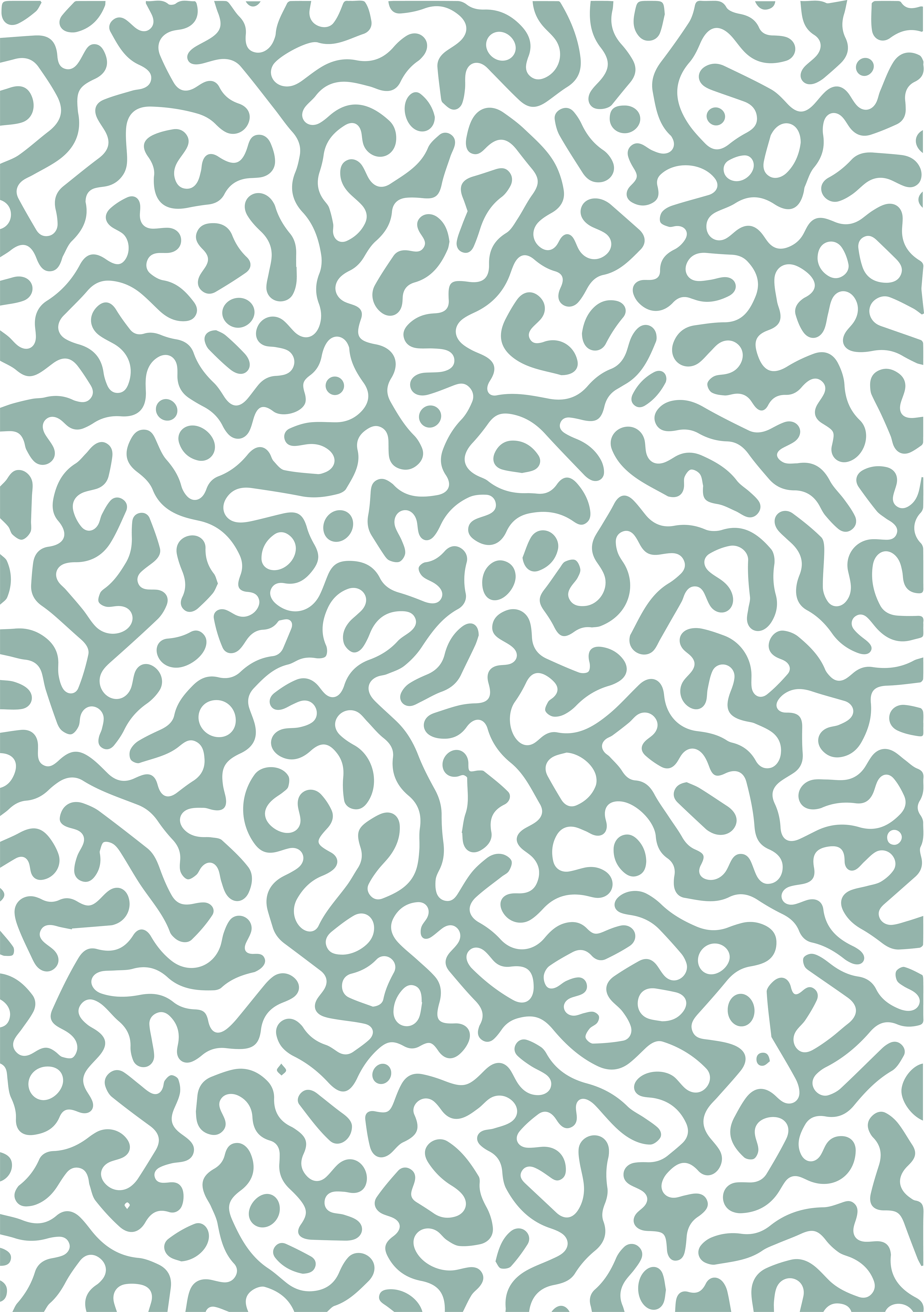
A Turing pattern is where two substances interact to produce stable patterns during morphogenesis. These patterns represent regional differences in the concentrations of the two substances. Their interactions produce an ordered structure out of random chaos. It is also soothing and organic, balancing the hard edged san serif logo. It brings a softness and a human side.
A Turing pattern is where two substances interact to produce stable patterns during morphogenesis. These patterns represent regional differences in the concentrations of the two substances. Their interactions produce an ordered structure out of random chaos. It is also soothing and organic, balancing the hard edged san serif logo. It brings a softness and a human side.


